ShopDreamUp AI ArtDreamUp
Early Comics
3 Subscribers
Thanks for helping me keep making comics! you get to see the comics earlier (about 5 days earlier) and for every 6USD, you have the right to ask Rayah a wish!
$1/month


Suggested Deviants


![[C] - Taunting Corplet](https://images-wixmp-ed30a86b8c4ca887773594c2.wixmp.com/f/eb400a58-933e-4177-b93a-9a567df45100/degkjb9-016143ee-67d6-4acc-9e9a-2990860026c1.png/v1/crop/w_184,h_184,x_0,y_13,scl_0.21420256111758/_c____taunting_corplet_by_captainquack64_degkjb9-92s-2x.png?token=eyJ0eXAiOiJKV1QiLCJhbGciOiJIUzI1NiJ9.eyJzdWIiOiJ1cm46YXBwOjdlMGQxODg5ODIyNjQzNzNhNWYwZDQxNWVhMGQyNmUwIiwiaXNzIjoidXJuOmFwcDo3ZTBkMTg4OTgyMjY0MzczYTVmMGQ0MTVlYTBkMjZlMCIsIm9iaiI6W1t7ImhlaWdodCI6Ijw9MTEwMyIsInBhdGgiOiJcL2ZcL2ViNDAwYTU4LTkzM2UtNDE3Ny1iOTNhLTlhNTY3ZGY0NTEwMFwvZGVna2piOS0wMTYxNDNlZS02N2Q2LTRhY2MtOWU5YS0yOTkwODYwMDI2YzEucG5nIiwid2lkdGgiOiI8PTg1OSJ9XV0sImF1ZCI6WyJ1cm46c2VydmljZTppbWFnZS5vcGVyYXRpb25zIl19.3p63wzZY7OdEBbnz-eCb9BeFOwOX4bfN-4uDvsevC4w)
![[C] - Taunting Corplet](https://images-wixmp-ed30a86b8c4ca887773594c2.wixmp.com/f/eb400a58-933e-4177-b93a-9a567df45100/degkjb9-016143ee-67d6-4acc-9e9a-2990860026c1.png/v1/crop/w_92,h_92,x_0,y_7,scl_0.10710128055879/_c____taunting_corplet_by_captainquack64_degkjb9-92s.png?token=eyJ0eXAiOiJKV1QiLCJhbGciOiJIUzI1NiJ9.eyJzdWIiOiJ1cm46YXBwOjdlMGQxODg5ODIyNjQzNzNhNWYwZDQxNWVhMGQyNmUwIiwiaXNzIjoidXJuOmFwcDo3ZTBkMTg4OTgyMjY0MzczYTVmMGQ0MTVlYTBkMjZlMCIsIm9iaiI6W1t7ImhlaWdodCI6Ijw9MTEwMyIsInBhdGgiOiJcL2ZcL2ViNDAwYTU4LTkzM2UtNDE3Ny1iOTNhLTlhNTY3ZGY0NTEwMFwvZGVna2piOS0wMTYxNDNlZS02N2Q2LTRhY2MtOWU5YS0yOTkwODYwMDI2YzEucG5nIiwid2lkdGgiOiI8PTg1OSJ9XV0sImF1ZCI6WyJ1cm46c2VydmljZTppbWFnZS5vcGVyYXRpb25zIl19.3p63wzZY7OdEBbnz-eCb9BeFOwOX4bfN-4uDvsevC4w)


Suggested Collections


You Might Like…


Comments31
Join the community to add your comment. Already a deviant? Log In
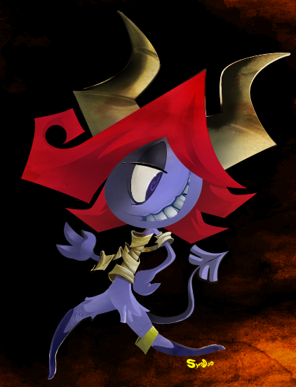
This is a good piece. It's cute, imaginative, and like most of your stuff it's a lot of fun to look at. That said, when it comes to a lot of the fundamentals I'm noticing a lot of issues in this which keep it from having the greatest impact possible.
For the purposes of this critique I'm going to compare it to the rest of your work since it's a pretty good representation of your work as a whole over the years and you wanted some input on your work as a while anyways. Which works out because this piece is actually a decent example of what you've been doing both right and wrong as time goes by. At least since you started posting on DeviantArt anyway. This will probably get fairly long. Just keep in mind that I DO actually like this piece and your work as a whole. I just want to see your stuff taken to the next step.
OK, so first and foremost you are having issues with value control (the balance of lights and darks for the art newbies out there). Pop this piece into Photoshop and switch the mode to grayscale. Notice the large amounts of black and gray with little in the way of lights or contrast to make things pop. Is this a light object on a dark background? Or a dark object on a light background? Where is the light coming from? What kind of light source is it? Why is it hitting his head and chest but not his legs? It's hard to say because your soft style of shading is working against you here. Dim light in a dark room actually makes pretty stark results. Light a candle and turn out the lights to see what I mean. Your lights should actually be a lot lighter and your darks a lot darker.
I want to highlight this issue first because I think it's something you're getting worse at rather than better as time goes on. Take a look at this earlier piece of yours:
[link]
You've improved in a lot of ways since then, however your value control back then was actually a lot better than much of your current work. The star (very bright) draws the eye to the character's face (which is also fairly bright) which then draws the eye down to the planet where the gradient gently leads the eye off the page. It's less detailed than your newer work, but a much stronger composition because of it's simplicity. This holds true even when I turn it grayscale.
Your newer work by comparison has a lot of gray in it, even when the characters are directly lit and outside. When strong contrast is present it can be a little all over the place:
[link]
Here the white is everywhere, drawing the eye in a million directions at once and distracting the reader from the fun scene unfolding in the foreground. Which in grayscale renders as gray and gets lost in the white of the clouds.
I'd recommend you do some value studies with charcoal and start putting the principles you learn from them into your work more. I think you'll notice a dramatic difference after only a few weeks.
The second major issue I'm having with this one is your gesture. He just doesn't look like he's standing on anything. He's just sort of.. Skipping? Posing? Strutting? This is another bad habit of yours I noticed. You tend to avoid having your characters interact with the world around them and scarcely have them take realistic poses. They're almost always flying, jumping, balancing on one toe, or standing on a hill with their feet hidden.
Characters look their best when they are interacting with things. Both in a physical sense and in an interpersonal sense. For example take panel 2 in this comic of yours.
[link]
I think the poses here are successful because it shows two characters directly affecting a part of their world (each other plus the ground). Meanwhile the next panel doesn't look nearly as interesting because the character just floats in front of his house. The issue is then compounded by the snow mound which makes the connection between the house and the kid ambiguous at best and as a result makes the panel feel like two plain images rather than a more interesting unified whole.
People like knowing the relationships between objects/people at a glance. “The boy is this high compared to the girl”, “The girl weighs enough to compact the dirt below her feet this much”, “The alien is this far from the back wall of the house”. That sort of thing. The more information you can provide to the reader while keeping the image easily readable, the more successful your work will become. In the case of this piece, simply rendering a little bit of the floor and planting the character's feet would have gone a long way.
Lastly you should work on your expressions a bit. They're not bad really. In fact I usually quite like them. However they can sometimes be a bit generic, repetitive or unclear. In this case it's the later. Can you tell me what exact emotion he's feeling right now? Joy? Pride? Why is he feeling that? When you draw your character's faces you should stop and put a few extra seconds into what they're faces are expressing and why. Don't just move around features until something clicks. Also, try to design more eye styles that you can use later on. Looking through your archive you only really have a couple which get reused a lot (closed round ovals and tiny dots mainly). Experiment some and see if you can make a dozen or so new face types using just the eyes as the main differentiating feature. Try rotating your round eyes 90 degrees and see what that does to the personality of your character. Try drawing their eyes higher on the face for a more mature look or draw them smaller with over sized glasses for that classic nerd appeal. You can also make the eyes so big they go off the side of the face or tweak with the shape and size of the pupil for some interesting effects. Try everything! If nothing else your core style will look better as a result. Plus experimentation is a great remedy for artists block.
That's all I can think of for now. Again, it's a cute piece and I like it. It's colored nicely, there is a ton of energy in it, and like most of your characters I want to get to know this guy more. It's the stuff beneath the surface which I think is holding you back. Take a little time to study your fundamentals a bit and I think you'll see your cartoon work improve by leaps and bounds.
Good luck! Looking foreword to your next piece!